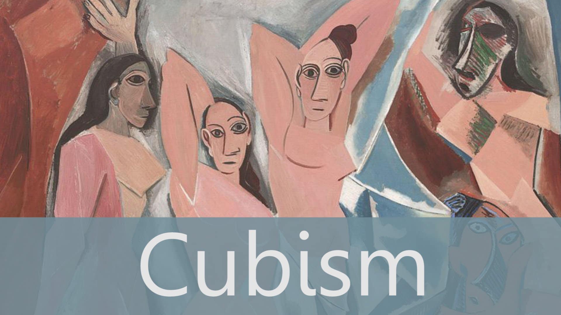
It can certainly be said that the person who invented Cubism was Pablo Picasso. The breakthrough piece is quite clearly Les Demoiselles d’Avignon, which marks a sudden change in style and shows the influence of African and primitive art forms. The nudes in the painting have mask-like faces and are made up of sharp angular forms. The overall effect is one of a fractured and distorted image. In terms of who invented the actual name ‘Cubism’, this came about in 1908 when the artist Henri Matisse described Georges Braque’s ‘Houses at L’Estaque’ as being made up of little cubes. Following this, the term quickly became widely adopted.
Who Invented Cubism – History, and Characteristics of Cubism
As with most modern art movements, Cubism sprang from a desire to break with the past and change the meaning of art. Cubism followed on directly from the work of Paul Cezanne, who was very concerned with structure and breaking down objects into their simplest forms, as well as emphasizing the multiple viewpoints of binocular vision.
The main characteristics of Cubism were the rejection of the single viewpoint in favor of showing the fragmented subject from several different points of view, combined with the simplification of forms. The Cubist artists went much further than Cezanne, representing objects as if they were visible on all sides at the same time.
Characteristics of Cubism – Analytical Cubism (1910 – 1912)
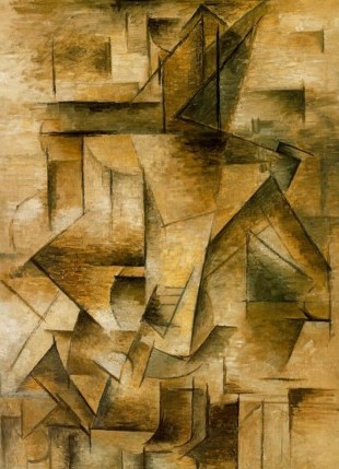
Two main branches of Cubism are generally acknowledged – Analytical Cubism and the later Synthetic Cubism. Analytical Cubism was concerned with breaking down forms analytically into simplified geometric forms across the picture. They were almost like drawings in the lack of color and monochromatic concentration on line and form.
An important exhibition of work by Paul Cezanne in 1907 was a huge influence on both Pablo Picasso and Georges Braque. Analytical Cubism was a direct development from Cezanne’s approach to painting. Picasso took this approach forward and Braque gave up his Fauvist style of painting to work with Picasso on the development of Cubism.
Characteristics of Cubism – Synthetic Cubism (1912 – 1920)
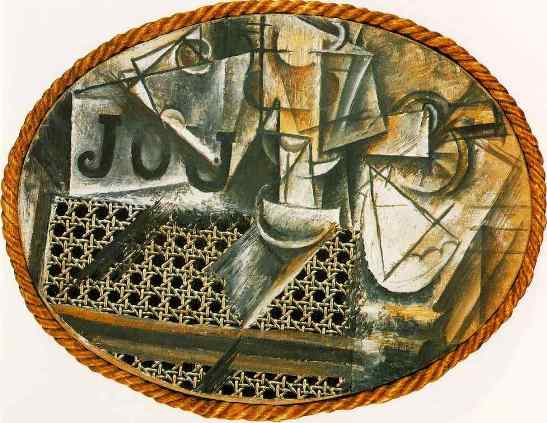
Synthetic Cubism is a later development of the Cubist Movement, and the first painting representative of this style is thought to be Pablo Picasso’s ‘Still Life With Chair Caning’ of 1912. The main characteristics of Synthetic Cubism were the use of mixed media and collage and the creation of a flatter space than with analytical cubism. Other characteristics were greater use of color and greater interest in decorative effects.
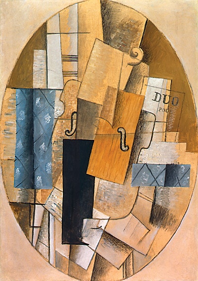
In the development of Synthetic Cubism, Picasso was the first person to use collage and text in a fine art painting. Cubist paintings included cuttings from newspapers, sheet music, pieces of cloth and painted text. Synthetic Cubism tended to push objects together rather than pick them apart for analysis. Many of the devices used were intended to flatten the picture plane and create an image with less depth than the earlier Analytical Cubist paintings.
Characteristics of Cubism – Georges Braque
Picasso and Cubism
No artistic movement this century has acquired greater prestige than Cubism. The latter is generally thought of as twentieth-century art par excellence. And yet, most of us have been bored at Cubist exhibitions. We are told that Cubism is Picasso’s great contribution to art, but we stare at those murky brown pictures, the one virtually identical to the other, with a sense of gloomy disappointment. But is it necessary we who are wrong? Let us look first at what the critics say about the pictures.
It is normally stated that Cubism is a continuation of the style of Cézanne. Whereas the Impressionists had kept to a single viewpoint, Cézanne gave an impression of, say, a hill as if he was moving his head slightly this way and that, thus suggesting different viewpoints and a certain ambiguity about where the object is situated in space. Picasso is supposed to be continuing in this line but adopting a multitude of viewpoints, which would explain why it is so difficult to make out what the picture is supposed to be of.
It is clear that if Picasso’s only achievement has been to mix these viewpoints together so that the objects depicted cannot be seen, then he has done no more than to hide the object and has revealed nothing! The critics answer this objection with the argument that although Picasso adopts many viewpoints the object depicted is still intelligibly described, i.e., we can tell what it is and where it is, and that he thus achieves the feat of enabling the spectator to see an object from different viewpoints at the same time. Now, whether the critics are right, and we can tell what it there, or we are right, and we can’t, is a simple matter of fact. If the critics are right then all they have to do is to take a picture like “Ma Jolie” (1912) and show how the pretty girl of the title can be reconstructed, i.e. how by working back from the various parts of the picture we can reconstruct the object in space that it is supposed to depict. Such an explanation has, alas! Never been given, and there are two simple reasons why it could not be. Firstly we cannot tell what color things are because Cubist pictures tend towards a single color, which means that objects can only be a lighter or darker shade of that color, and the light tends to be misty, which reduces the color’s visibility. If we look at Ambroise Vollard’s jacket in his portrait, we cannot tell if it is black or blue or grey. And secondly, the picture is cut up into jagged shapes, which, by disrupting the continuity of the surfaces (e.g. of a face), makes it impossible to tell the shape and position of things. So our conclusion must be that Ambroise Vollard’s face, for instance, is not described to us more comprehensively because from several viewpoints but is rather hidden from us. Cubism cannot be about visual realism. And so, we must ask, what is it about?
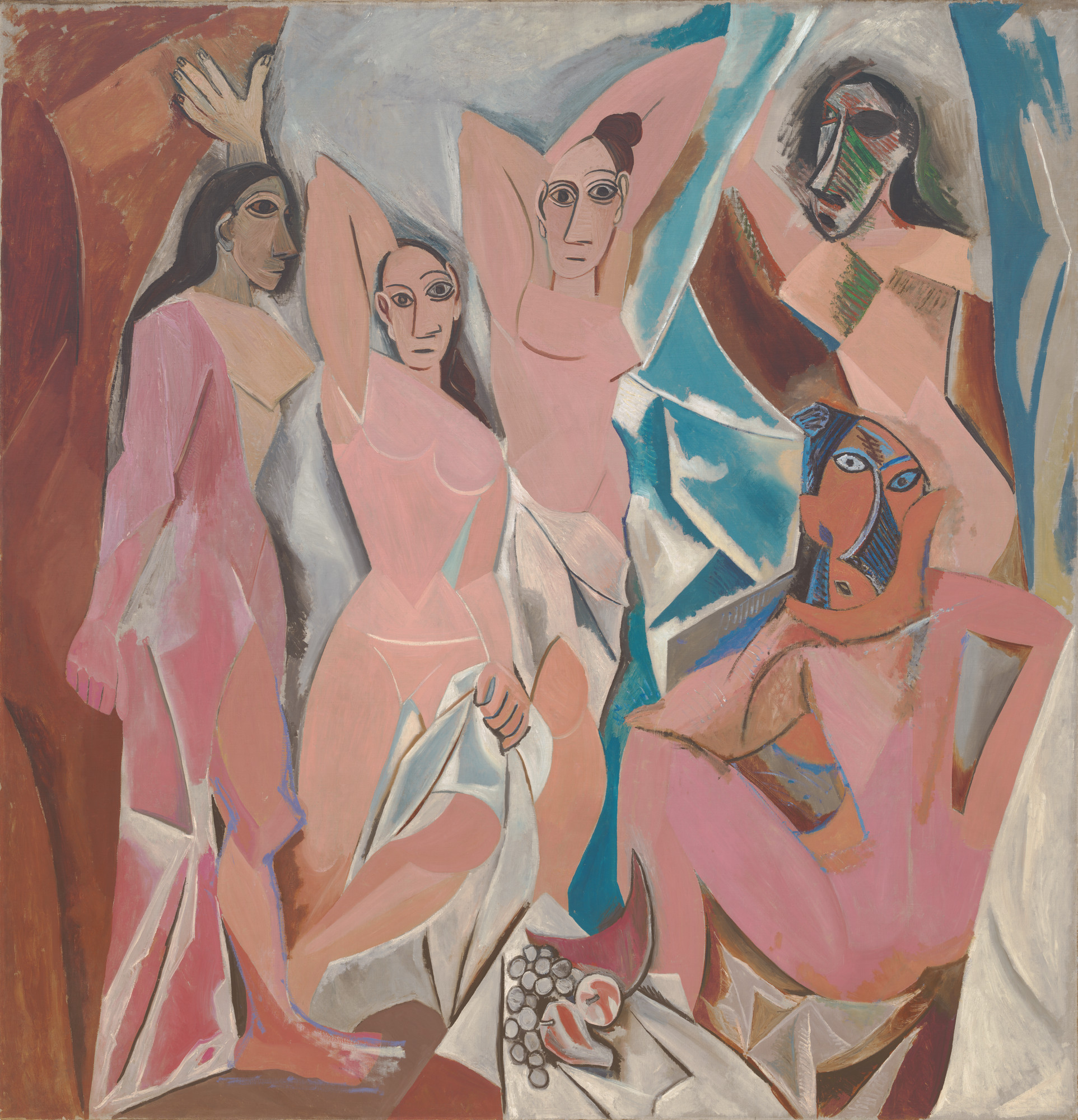
We have described how the portrait of Ambroise Vollard conceals the visual reality, but if we compare the picture to the “Demoiselles,” we are struck by its realism. The whole picture is a matter of light and shade. We have a much clearer impression of a human figure built up by light and shade, even if the visual information has been “scrambled.” Critics generally stress the continuity between the “Demoiselles” and Cubism: the one is supposed to have led to the other. But, in fact, they are opposite ways of expressing the relativity of sense experience. In the “Demoiselles” Picasso imagines an alternative kind of space, different from space as we normally know it – a warped space; our senses tell us that skin is soft so Picasso imagines it hard; and so we gain an impression of an alternative reality, which suggests to us that the reality which our senses bring to us may, in itself, be quite different from the way our senses describe it to us. In “Ambroise Vollard,” we are not given a series of alternatives – a different kind of space, different texture, different volume of a body, etc. – We feel that these qualities remain the same as normal. What has changed is our way of perceiving the objects: it is our sight that has become relative. This is merely the other side of the coin from the “Demoiselles” for vision involves two elements: the thing seen and the action of seeing. Now, the “Demoiselles” changed the thing seen – it gave us an image of the relativity of sense experiences by changing the objects of our vision (space, texture, etc.). Cubism leaves the objects of vision the same (we recognize the individual, Mr. Vollard) but changes the vision of the person who sees the object – it scrambles the visual messages – to give an impression of the relativity of sight.
Thus, whereas in the “Demoiselles” the normal qualities of objects are contradicted (e.g., space becomes discontinuous, a soft curtain material becomes hard, etc.) Cubism contradicts normal vision. Instead of seeing things in their normal colors, everything tends towards a single color, and thus color differences are replaced by differences in lightness and darkness. Instead of giving us a view of the roundness of things, our site gives us an impression of flatness (Vollard’s suit). Light does not, as normally, inform us as to the shape, volume, and position of objects but seems to shine too brightly on the object; it dazzles the spectator and disrupts the continuity of the image. And whereas our sight normally gives us a continuous view of space, Cubism’s sharp-edged lozenge shapes suggest a dislocation of the visual image, not unlike a broken television screen.
The objection to such distorted vision is obvious: what is there to distinguish a Picasso from the distorted holiday photo I get back from the chemist’s when I have used the wrong exposure time? The answer is the harmony of the composition. All the distortions of normal vision in “Ambroise Vollard” go together to give an impression of unity. And, more important still, Picasso has managed to achieve a balance between the figure of the man and the space that constitutes the background. It appears to be either emerging from the background or merging into it, which ambiguity is very reminiscent of the movement in Michelangelo. The drama of the picture lies in this tension between the man and space and light that surrounds him. There is, in this more than a suggestion of the theme of being and non-being, of existence and the void. It is a startling image of the precariousness of life. And the closed eyes and the mouth suggest that reposefulness which is the way the living conceive of death.
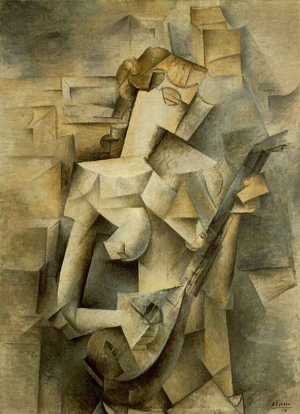
“Girl with a Mandolin” (1910) is an even more striking example of how Picasso’s distortions of reality are used to expressive effect. The picture’s magic and charm derive precisely from the shades of light and the simplified squareness of the body’s form. It is because the picture is unrealistically brown all over that all the shades from near white to near black can be used. And it is the combination of these shades that creates the extraordinary atmosphere of the painting, which is, by the way, so much less theatrical than that of the Blue Period. This magical atmosphere reaches its climax in the girl’s strumming hand, in the streak of pure light that runs along the line where the knuckles would have been. The delicacy of the hand is stressed by the simplicity of its form, especially at the wrist. It is very reminiscent of the strumming hand in Giorgione ‘s “Concert Champêtre.” The player’s right breast, too, gains in voluptuousness from the stark contrast between the light and dark shades of brown as well as from the unrealistically generous curve. It is surprisingly close in feeling to the nudes of the 1930s. The head gives us a fair idea of the hair-style, but little help with the features of the face and the roundness of the head is contradicted by a square outline. And yet what delicacy we divine behind this exterior. And is it not axiomatic that a woman’s charms are enhanced by concealment?
It is almost too obvious to require comment that the picture gains in meaning by being about a young girl and music. However beautifully Picasso had rendered it, a fish-knife in the girl’s hands would have radically altered the meaning of the work! And yet, it is generally believed by critics that Cubism taught us that art is about style and not subject – matter. But if we look at a picture like “Ma Jolie” of 1912, a title which means “My Pretty Girl,” are we not entitled to be disappointed? What does the painting tell us about the girl’s prettiness? If we reject the view that everything Picasso did must be good and reflect on the matter objectively, there is a good reason to believe that the abstraction of late Cubism marks a decline in artistic expression.
It seems to me that in late Cubism, Picasso was pursuing a philosophical will-o’-the-wisp, but in order to understand this, it is necessary to examine the philosophical implications of the earlier Cubist pictures we have already discussed. They teach us that our site is as much a mental as a physical faculty. When we see an object, we also, in a sense, create it. If I stop looking at these lines, they do not stop existing because they are still there when I look back, but we cannot tell in what form they exist when nobody is looking at them. Now, what “Ambroise Vollard” and “Girl with Mandolin” convey is precisely this process by which we call objects into being by looking at them. The objects, the man and the girl, are not fully formed, not because our vision is blurred, as in an Impressionist’s rainy street, but because the object has not fully emerged into the form, it takes on as a result of our looking at it.
Picasso might, of course, have made his pictures more and more blurred by merging the colors of objects with one another by making all the colors progressively lighter, which would have led to a completely white canvas, or darker, which would have led to a black canvas. In this way, he would have expressed the idea that objects disappear when we don’t look at them, but that white or black canvas would express nothing more than that fact: it would not tell us anything about the nature of the object when it is not being looked at. What Cubism does is to express in visual terms our knowledge that the object, though not being looked at, still exists. Its achievement is to have found a visual way of expressing something that is not visual. This may sound paradoxical but, if we think about it, the same paradox applies to all naturalistic representation for a picture can only represent one instant in time cut off from all others whereas, in reality, all our instants of vision are joined up into a continuum of time. In reality, one instance cannot be disjoined from the one that precedes it and does it not by copying the way we see things but by suggesting the knowledge we have of them. Thus a picture by Manet of horses running does not simply copy a visual image that meets our eye when we see horses running. Such an image cannot exist because the movement is something we see in a continuum of time: we follow the movement in time. A cine-camera can show us movement because its film moves through time, but an individual photograph cannot show us movement because it is limited in time to a single instant and can thus only show us a horse that is still. Therefore Manet’s picture cannot possibly be a picture of real movement. It must be a mental abstraction. He has shown what movement would look like if it could be viewed in a single instant. He has done this by using light to break up and blur the forms. This gives the impression that our sight, static in a single moment, is unable to grasp the forms perfectly because they are in movement. In this way, he gives us an image of movement seen in a single instant, which amounts to a static view of the movement, what movement would be like if it could be stopped. It is obvious that such a depiction of reality can only be an abstraction of the mind, a way of imagining what reality is. In the same way, Picasso finds a visual way of describing the mental abstraction of an object in the process of coming into being. It is clear that no picture could be the same as this process as the latter is a mental rather than a visual process – an object coming into being is quite different from an object that looks blurred, perhaps because it is distant, and gradually becomes clearer as we focus more intently on it – Picasso deliberately paints those objects that have those qualities that make for precise vision (they are still and close).
Now it would be seen that this process of breaking up the visual image could be continued until we were left with an image of an object totally independent of its normal visual qualities, i.e., an image of an object as it is in itself, as a visual potentiality. In such a picture, we should be unable to distinguish the object at all. But if the object is unrecognizable this means the depiction of any object would be indistinguishable from any other, which would mean that no object could be depicted for what we call an object is by definition that which is not a whole lot of other things (a girl is not a table or a hair-dryer etc.).
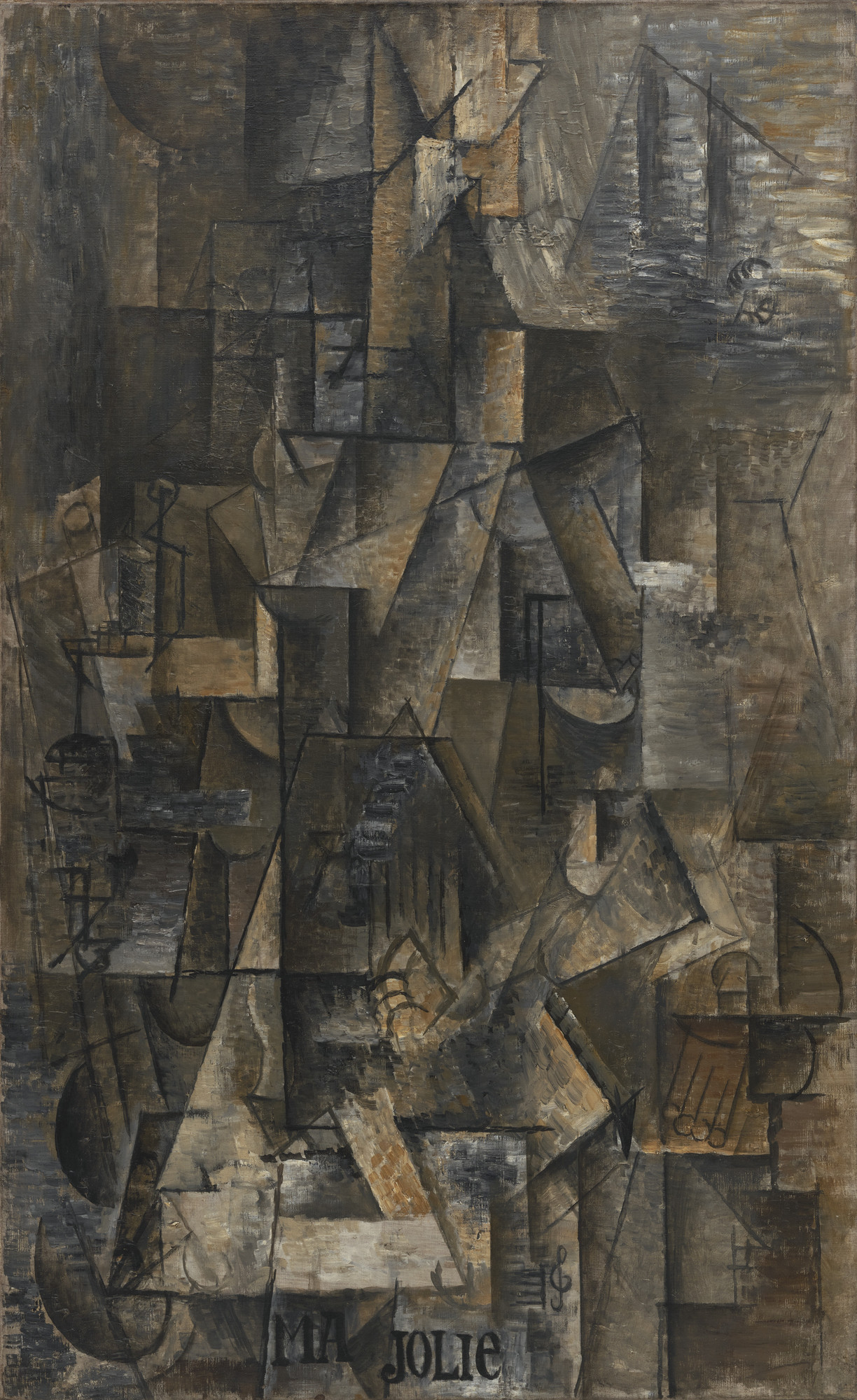
This is, I think, the reason for all those boring murky brown pictures of table-tops and newspapers and pipes. Picasso believed that in Cubism, he had found a method of depicting the real nature of objects, as distinct from our normal way of seeing them. He thought that he could express the reality of objects that lies beneath their visual appearance. Thus the “reality beneath” becomes the important thing, and the object becomes less important. And so it does not matter if the object is unrecognizable – what we see in the picture, the “reality” of the object, is what counts! The trouble is that by rendering an object in such a way that it is unrecognizable, we lose the sense of the distinction between objects: all objects are the same. This has two unfortunate consequences. Firstly, the world becomes unintelligible because it is no longer possible to tell one thing from another. And if we cannot tell the difference between things, then we cannot speak in terms of greater or lesser value: my mother cannot be more important than my shoes because I cannot tell the difference. And secondly, when the object disappears, so does the tension in the picture’s composition for the object is no longer fighting for its visual survival. There is no tension between the figure and the background as they have become one. The reason why the style of a picture like “Girl with Mandolin” is so delicate and beautiful is that it is about girls and music. It is about something we understand in terms of human value. The style does no more than to express that value. And so, when the girl and the music disappear, we are bound to lose the poetry of the style and be left with dark brown geometry.
The artist realized this, either consciously or unconsciously, for he went to great lengths to preserve the identity of the object. In “Ma Jolie,” he writes the title on the canvas. In other words, he renders certain significant objects in the recognizable form to give clues as to the identity of the person depicted. And in “collage”(which is French for “sticking things on”), he took to sticking real objects, like bits of newspaper, onto the canvas. But these attempts to restore intelligibility could not do more than paper over the cracks, sometimes literally! Late Cubism represents a bankrupt vision of man by making human values impossible. Some critics would have us believe it is his greatest achievement and that the rest of his career represents a regrettable deviation from it. We should be grateful the artist did not agree.
